


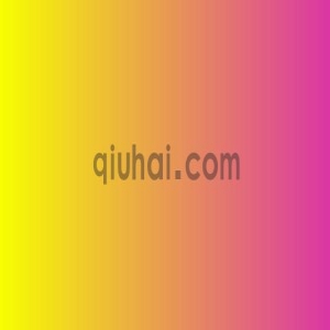
一、背景色渐变
1 2 3 4 5 6 | .box{width: 300px;height: 300px; background: -webkit-linear-gradient(right, red , blue); /* Safari 5.1 - 6.0 */ background: -o-linear-gradient(right, red, blue); /* Opera 11.1 - 12.0 */ background: -moz-linear-gradient(right, red, blue); /* Firefox 3.6 - 15 */ background: linear-gradient(right, red , blue); /* 标准的语法(必须放在最后) */ } |
色值还可以可以用
1 | background:linear-gradient(to left,rgba(232,0,0,0.3) 10%,rgba(0,51,204,0.6) 30%,rgba(0,51,204,1) 100%) |
二、字体渐变色
1 2 3 4 5 | .box{width: 300px;height: 300px;font-size: 100px; background-image: -webkit-linear-gradient(bottom, rgb(0, 0, 0), rgb(255, 255, 255)); -webkit-background-clip: text; -webkit-text-fill-color: transparent; } |
三、镂空字体
1 2 3 4 | input::-webkit-input-placeholder { color: red; }/* WebKit browsers */ input:-moz-placeholder { color: red; }/* Mozilla Firefox 4 to 18 */ input::-moz-placeholder { color: red; }/* Mozilla Firefox 19+ */ input:-ms-input-placeholder { color: red; }/* Internet Explorer 10+ */ |
五、给图片加上内阴影
1 2 3 4 5 6 7 8 9 10 11 | .demo{ -webkit-box-shadow:inset 0 0 30px #FF1493; -moz-box-shadow:inset 0 0 30px #FF1493; box-shadow:inset 0 0 30px #FF1493; display:inline-block; }.demo img{ position:relative; z-index:-1; display: block; } |


发表评论
加载中~